LIBERADO TEQUILA
Logo Development | Branding | Illustration | Packaging
THE PROJECT
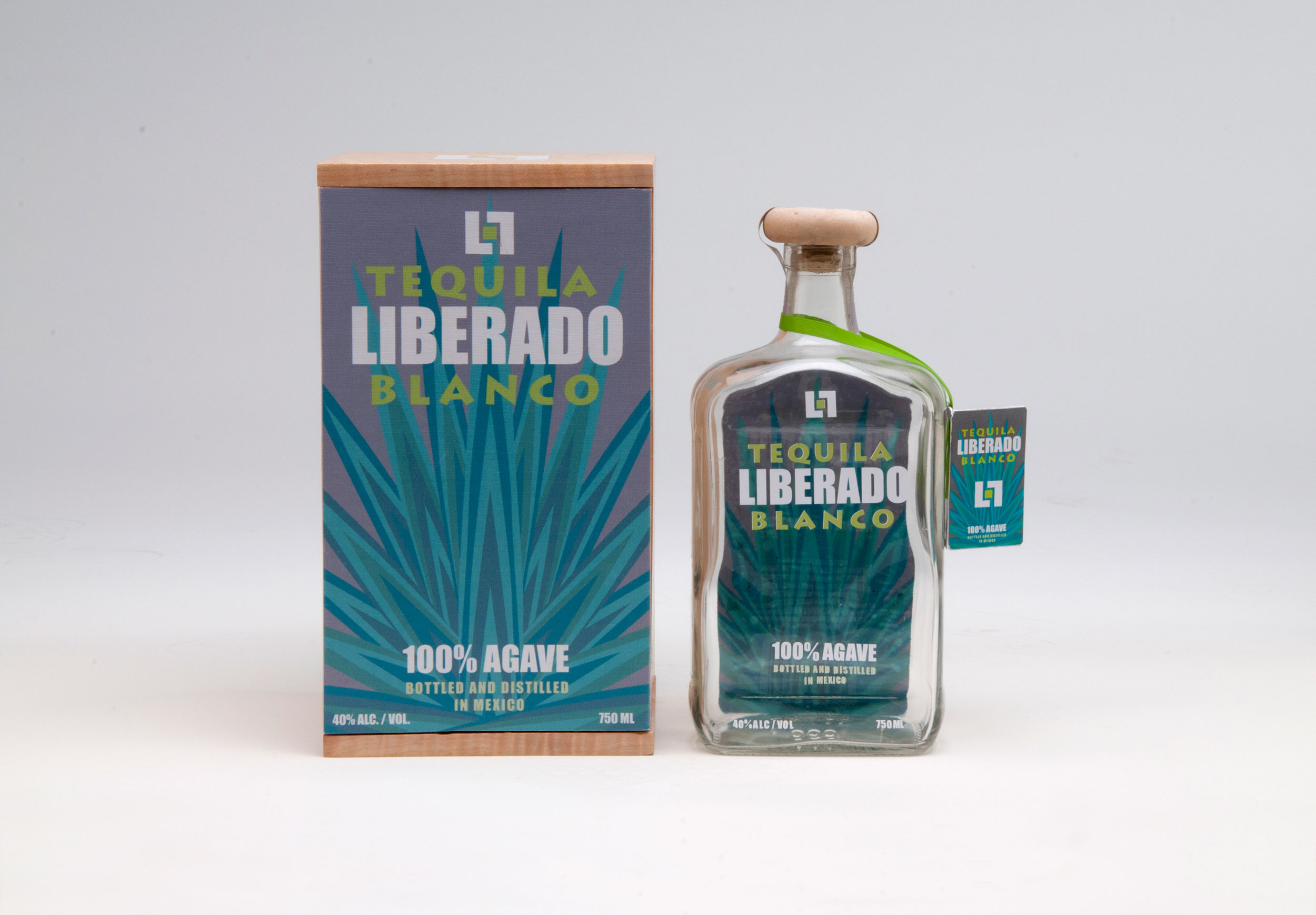
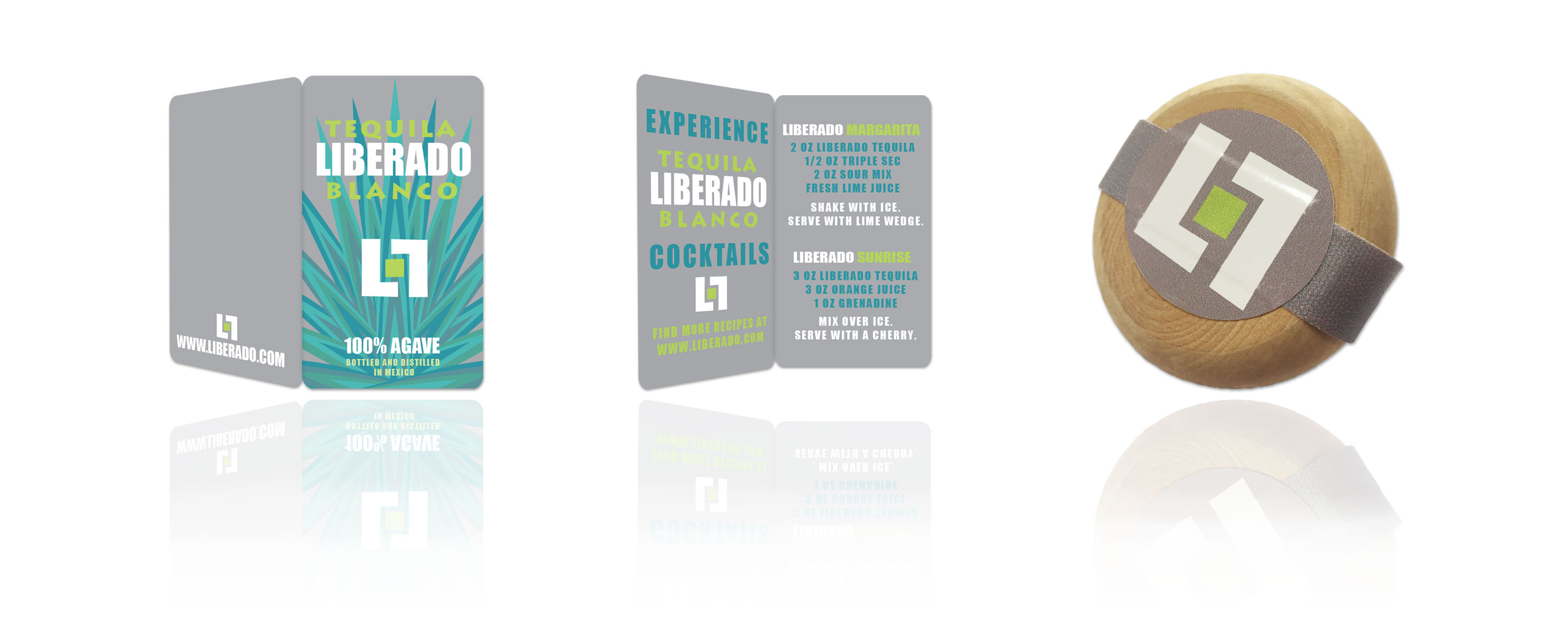
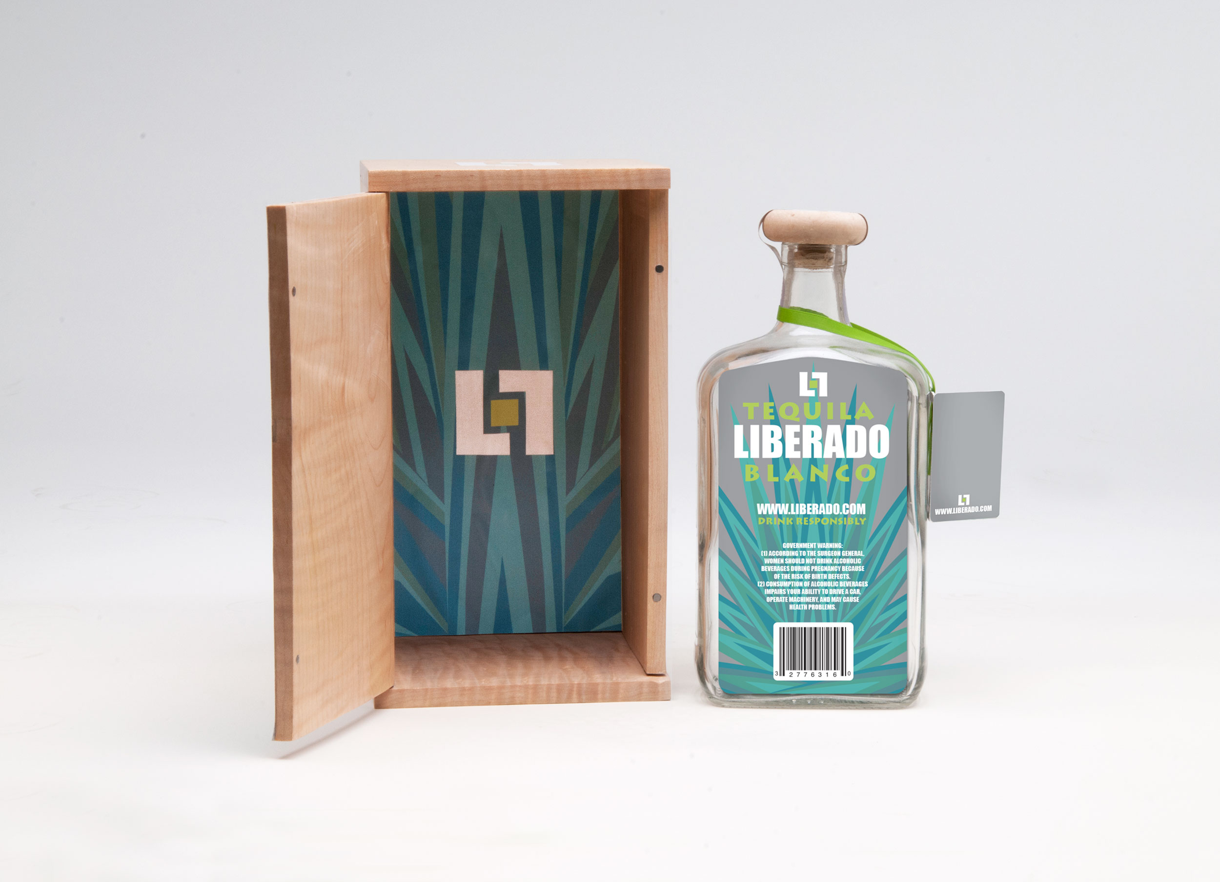
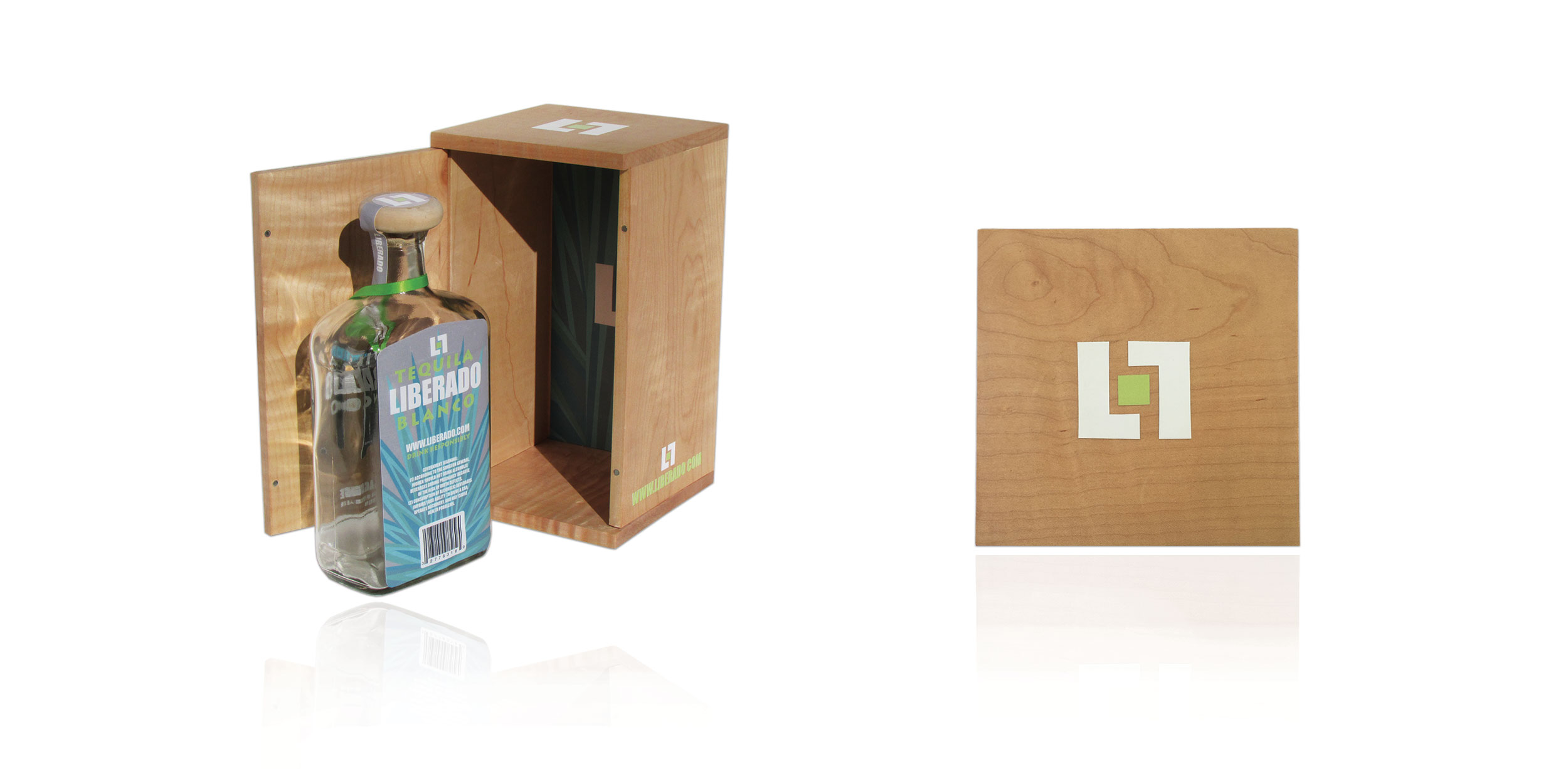
It’s not everyday that you get to name a tequila company. When brought to the challenge, we let the brainstorming begin to find a name that would suit the lively feeling that tequila can provide. After much research and product tastings, Liberado Tequila was born and it’s meaning was perfect. In Spanish, Liberado translates, “to be liberated or freed.” Our next step was to take this energetic name and develop a proper logo, branding, and packaging to support its free-spirited nature.
Packaging Concept
Liberado’s packaging illustrations were inspired by the Mexican blue agave plant which is the base ingredient that is cooked and fermented into tequila.