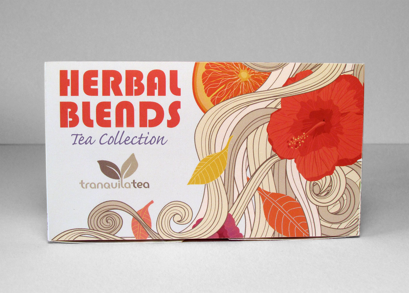
TRANQUILA TEA
Logo Development | Branding | Illustration | Packaging
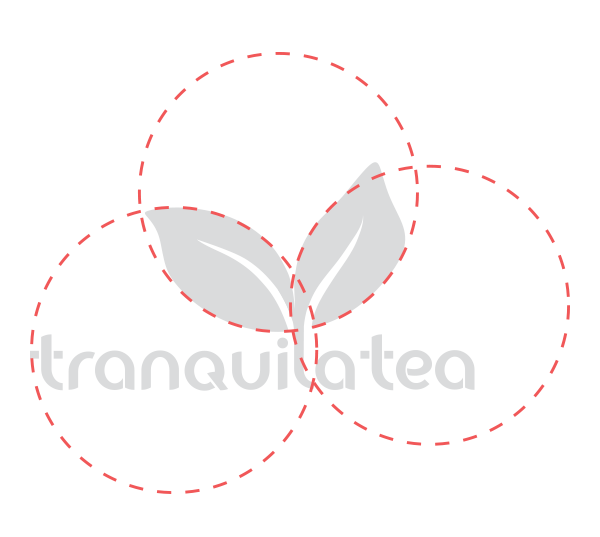
THE PROJECT
We developed this name by using a play on the word “tranquility”. It’s calm and soothing meaning was perfect for a tea brand who’s customers were seeking relaxation. We then developed a logo and branded it with an illustrated and eye-catching package.


Packaging Concept
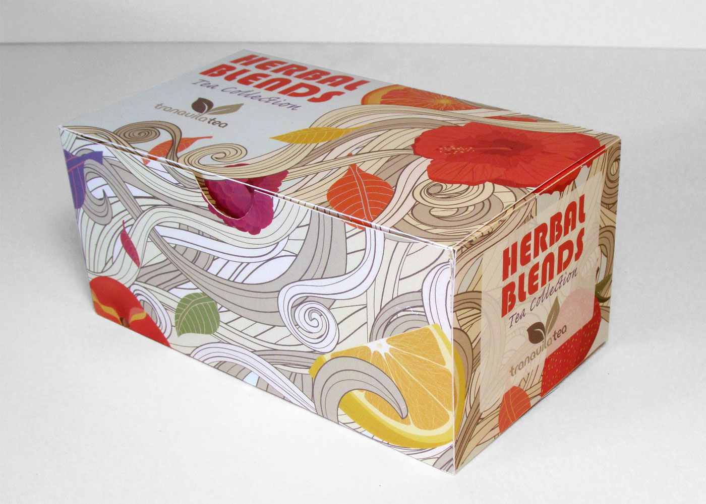
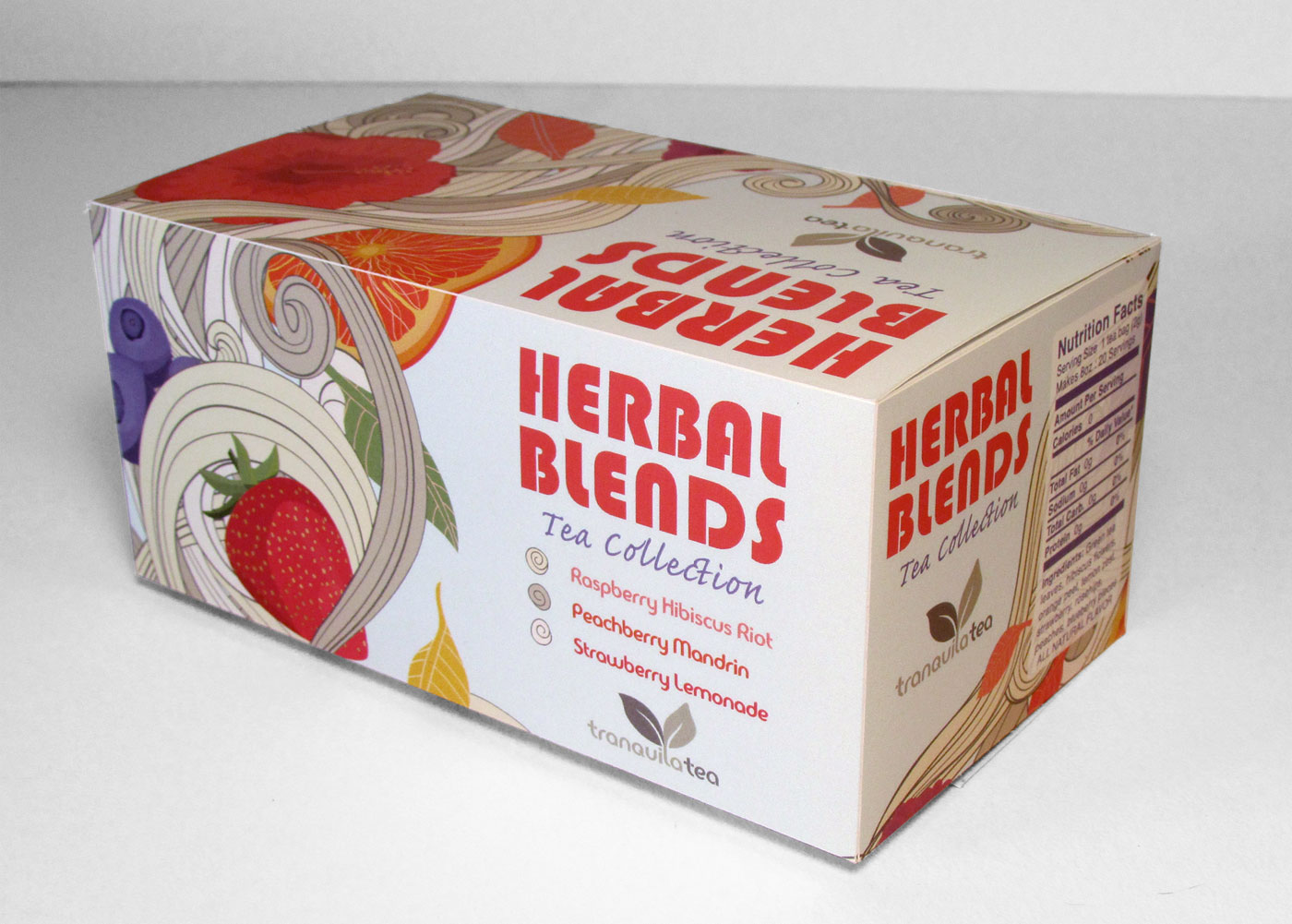
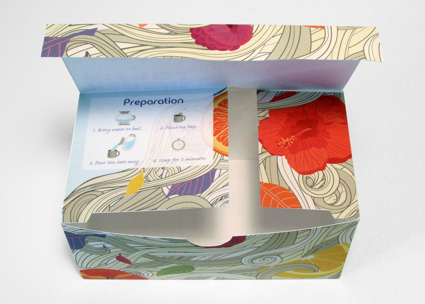
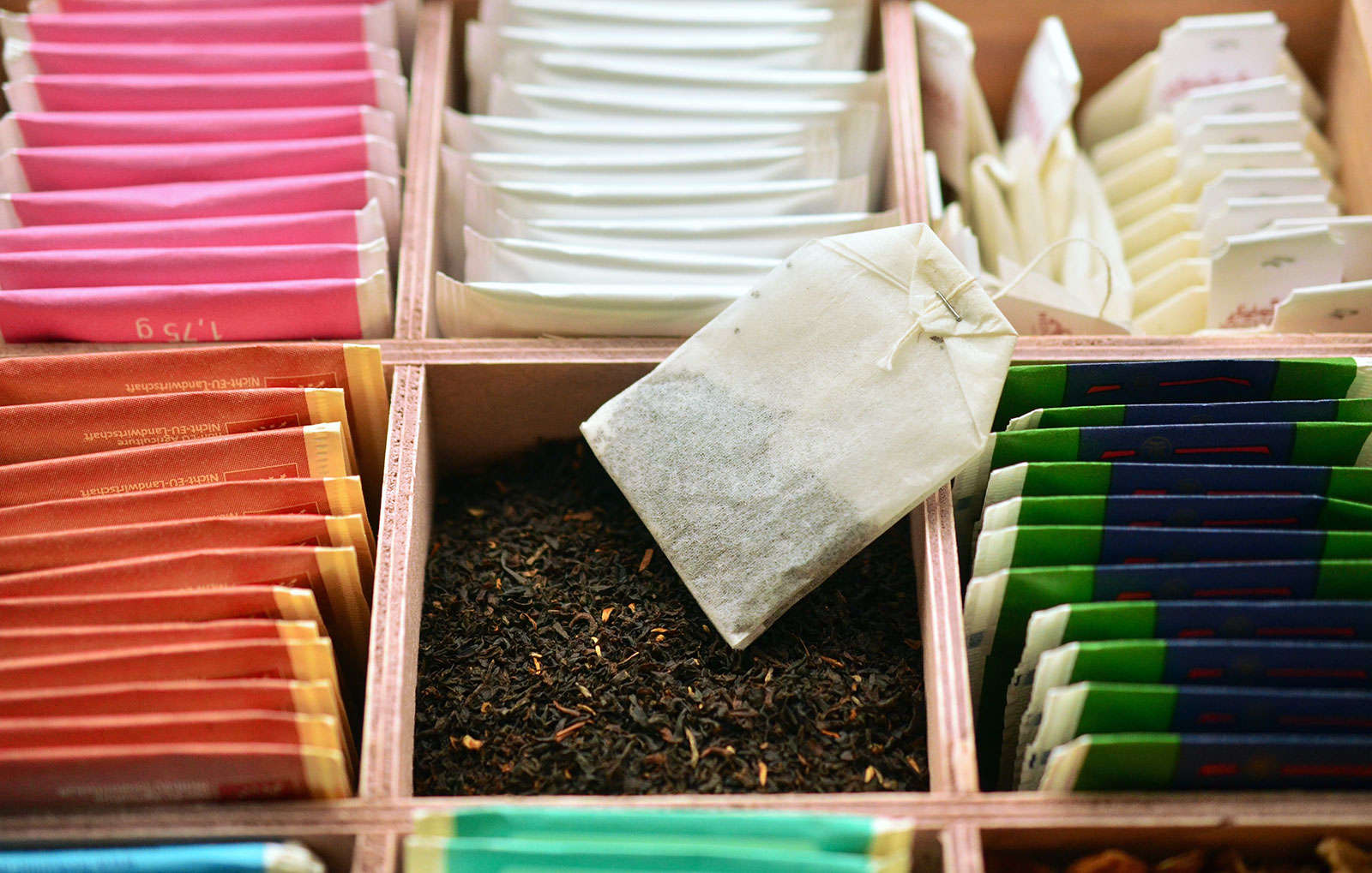
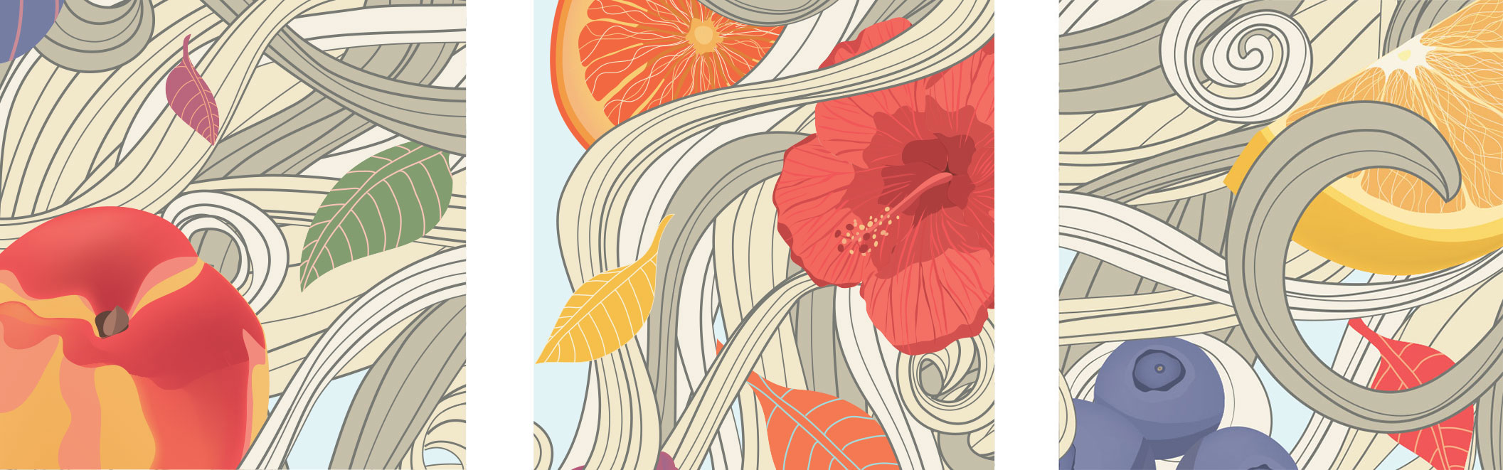
Tranquila Tea’s packaging illustrations were inspired by the variety of fruits and flavors infused into their Herbal Blends Tea Collection.
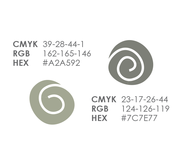
A bright color pallet and illustrated organic shapes pull the whole package together.
Packaging Sketch
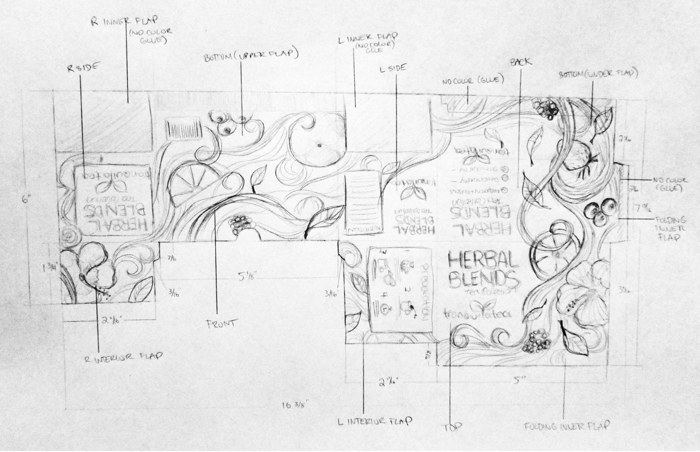

The Layout
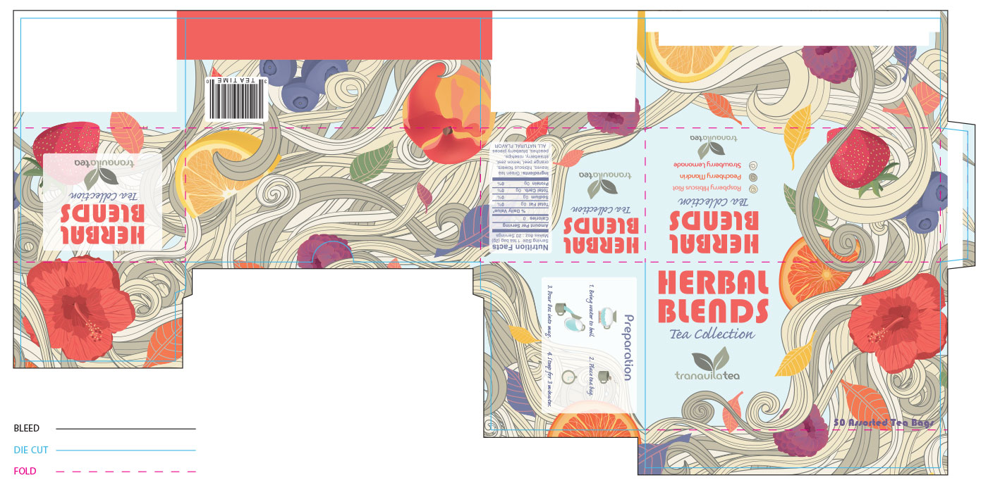
Illustration Details
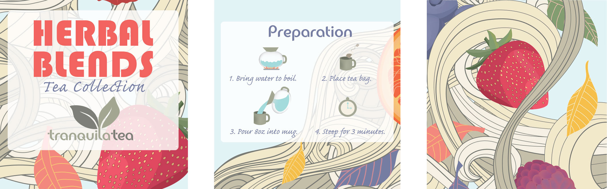
The Package